CSS (or Cascading Style Sheets) is bringing some new features to help you put some styles on your web pages in the most efficient way. In this article, we are going to go through the ones that will most likely make your coding easier in 2023. Some of them were available already but weren’t supported by all modern browsers until now.
We’ll see further in this article what they are.
Summary
1. Container Queries
When creating a web page for mobile, we are usually relying on Media Queries in order to adapt the layout based on the screen size. But what if you want to apply modifications based on the size of a content block? That’s what Container Queries are for. They allow you to modify the style of an element based on the size of the parent, unlike the Media Queries which apply the changes based on the size of the viewport.
Example:
In this example, the green block is set to have the text changed in black when it reaches less than 600px of width (Container Queries). The same rule is applied for the grey block but based on the size of the screen (Media Queries).
Screen with a width of 1200px:

The size of the green block becomes less than 600px:

The screen size is lower than 600px:
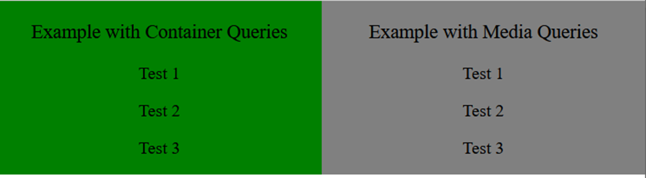
Nowadays, we have so many different ways to view a web page, so we need to have maximum flexibility to do so. Container Queries is a good addition to the Media Queries for it.
2. New Viewport Units
When developing a web page it is important to take into account the size of the screen. One way of designing with viewport is by using the viewport height unit, vh/vw (100vh being 100% of the height of the screen).
The problem with this method is that the browser’s toolbar height is not taken into account on mobile devices:
- Blue arrow: Height of the page displayed
- Red arrow: Height visible on the screen

To solve this issue, new unit values are now available :
- Small viewport (svh/svw) : takes the address bar and the toolbar into consideration
- Large viewport (lvh/lvw) : doesn’t take the address bar and the toolbar into consideration
- Dynamic viewport (dvh/dvw) : adapts its value when the toolbars are visible or/and when they are not.
It is important to know that these units don’t take into account the scroll bar. So depending on the situation, you might want to use one unit value over the other or just use another unit than the viewport.
3. CSS Nesting
With CSS preprocessors like Sass or Less, we can nest a CSS style rule within another rule. It allows developers to write clean and understandable code by reducing redundancy and grouping lines. This is finally possible with native CSS with the syntax & or @nest.
& syntax
The & has to be at the beginning of the selector for it to be valid. We can see it as a replacement for the parent selector.
Example:

As you can see in this example, nesting can be combined with Container Queries.
4. Individual Transform Properties
A good way to give your website some animations or transitions is to use the transform property in CSS. The problem is if you want to change just one of the transform properties later on, you must write the whole definition again for all properties.
Example:
.childBlock1:hover {

              transform: translateX(0%) rotate(0deg) scale(0.9);

}

@media (max-width: 800px) {

              .childBlock1:hover {

                             transform: translateX(0%) rotate(0deg) scale(1);

              }

}
In this example, the block will reduce its scale when we hover it with the mouse but we don’t want to have this effect when the screen is lower than 800px. As we see from all the 3 properties (translate, rotate and scale), only scale changed here, yet we have to repeat all other parts.
This is not the case anymore, with individual transform properties we can adapt each property individually.
Example:
.childBlock1:hover {

              scale: 0.9;

}

@media (max-width: 800px) {

              .childBlock1:hover {

                             scale: 1;

              }

}
This is the same as the code above. The code is now simpler and cleaner and we don’t have to go through the trouble of writing the other properties.
5. Inset Property
Another property that gives us a shortcut in our code is the Inset property. This property replaces the four other properties: top, right, bottom, and left, allowing you to specify the inset of the positioned element on all four sides at once.
The order is in clockwise order just like it would be for a margin or padding.
Example:

In this example, the grey and green blocks show the same result but with the Inset property, we get to write the position in one line.
6. Accent-color Property
Forms are one of the most common things to find on a website. If you have a form, there is a chance that you included checkboxes or radio buttons. Those elements are difficult to customize and most of the time, they are hidden and replaced with custom widgets.
The new CSS accent-color option allows you to have quick customization and give some colors to them.
Example:

The option might not be as evolved as some people expected, but it can give you quick customization and save you some valuable time.
7. Gap Property for Flexbox
To specify the same distance between rows and columns, we needed to use the margin property. However, this had one inconvenience, the first and last elements also inherit the spacing around their edge which is not always intended. To avoid this issue, we would have to target those elements and apply an exception.
In contrast, the gap property allows us to put a space between the blocks without having to manipulate the first and last elements.
To achieve that, we have 2 ways to write that :
- In one line with the property
gap - In two lines with the properties
row-gapandcolumn-gap
Example:

The result could’ve also been achieved by just writing gap: 30px 20px;. In the case where the row and column have the same value, the code could be even more simplified with gap: 30px;.
8. Logical Properties (Inline and Block)
We already have a shortcut for writing properties like margin or padding by setting the values on the x and y-axis. The inline and block properties allow us to do the same but it can even be applied to others like border, size… Inline applies to the horizontal while block applies to the vertical.
Example:
")
9. nth-of syntax
We are already familiar with the syntax nth-child in CSS, but now it’s getting a bit more advanced with the introduction of the keyword “of” which allows us to target more specifically an element.
:nth-child(x of . myClass) will first pre-filter all elements with the class myClass, and then target the element number x from the list.
Example:

In this example, div:nth-child(2) lets us target the second div from the block list1, while in the list2 the div:nth-child(2 of .bottomThree) will first select all the elements with the class bottomThree and then give us the second element from it (which in this case is the 5th element of the list).
10. Selector :has()
With the feature above, we have a way to select a particular child element from a selector. With the :has() selector, we can apply styles by checking if a parent element contains specific children, or if those children are in a specific state. It’s essentially a “parent” selector.
We have different syntax for this selector:
h1:has(p): Selects the <h1> who have a <p> tag as a child no matter the level of it.h1:has(> p): Selects the <h1> who have a <p> tag as a direct child.h1:has(+ p): Selects the <h1> who are directly followed by a <p> tag.
")
Example 1 fills all the conditions so the texts are displayed in blue and red like they should.
Example 2 gets no style because the conditions are not met:
- The
<h2>is not a direct child because it is inside a<div>(subBlock2) - The red is not applied because there is a
<br>in between the<p>and<h2>.
Example 3 has the condition met because the <h2> is a child of #textBlock3. The level it is in doesn’t matter.
The :has() selector can be combined with another :has() and/or :not() which can allow us to do logical operators like AND and OR.
This property is still under development for Firefox but it is compatible with the other browser.
In Conclusion
We’ve only highlighted a part of the new CSS trends here, but 2023 brought us some more nice features that will make writing CSS a lot easier with less code and more flexibility.
We’ve got also a lot more options to create a responsive design which is a major factor in creating websites nowadays. One thing for sure is that CSS is not going to stop evolving and we can only expect more to come in the future.
More Resources
To learn more about the CSS cascade layers, you can take a look at our insight Cascade Layers Explained.
Read more Insights on Software Product Engineering.

Thanks to our
Author